As data scientists we aim to present results in simple formats that can be understood by technical colleagues and the general population.
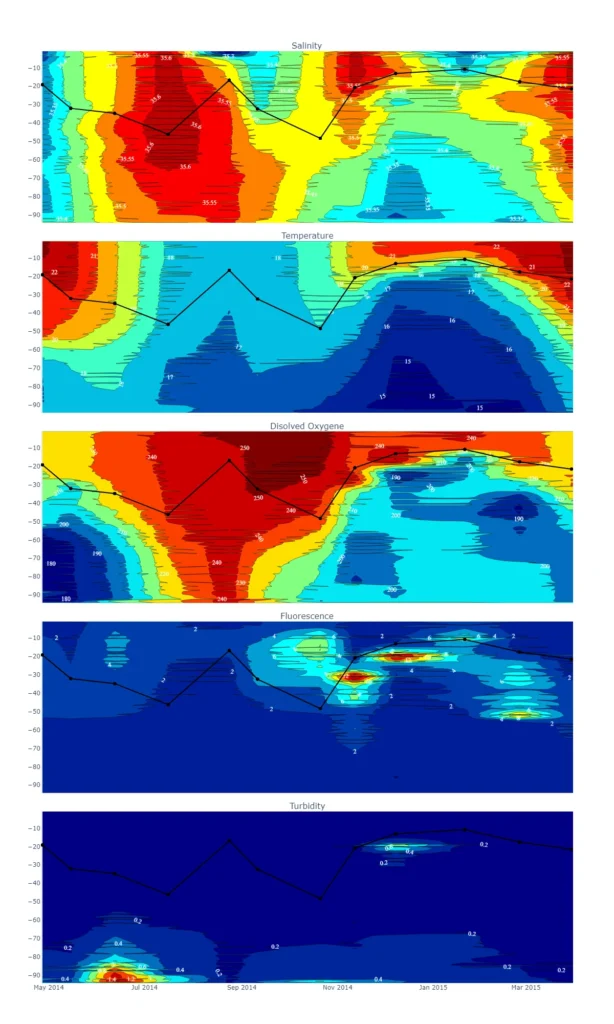
CTD data describing the water column near Sydney Harbour
The lines cutting through the water column represent the Mixed Layer Depth (Canuto and Dubovikoc 2006)
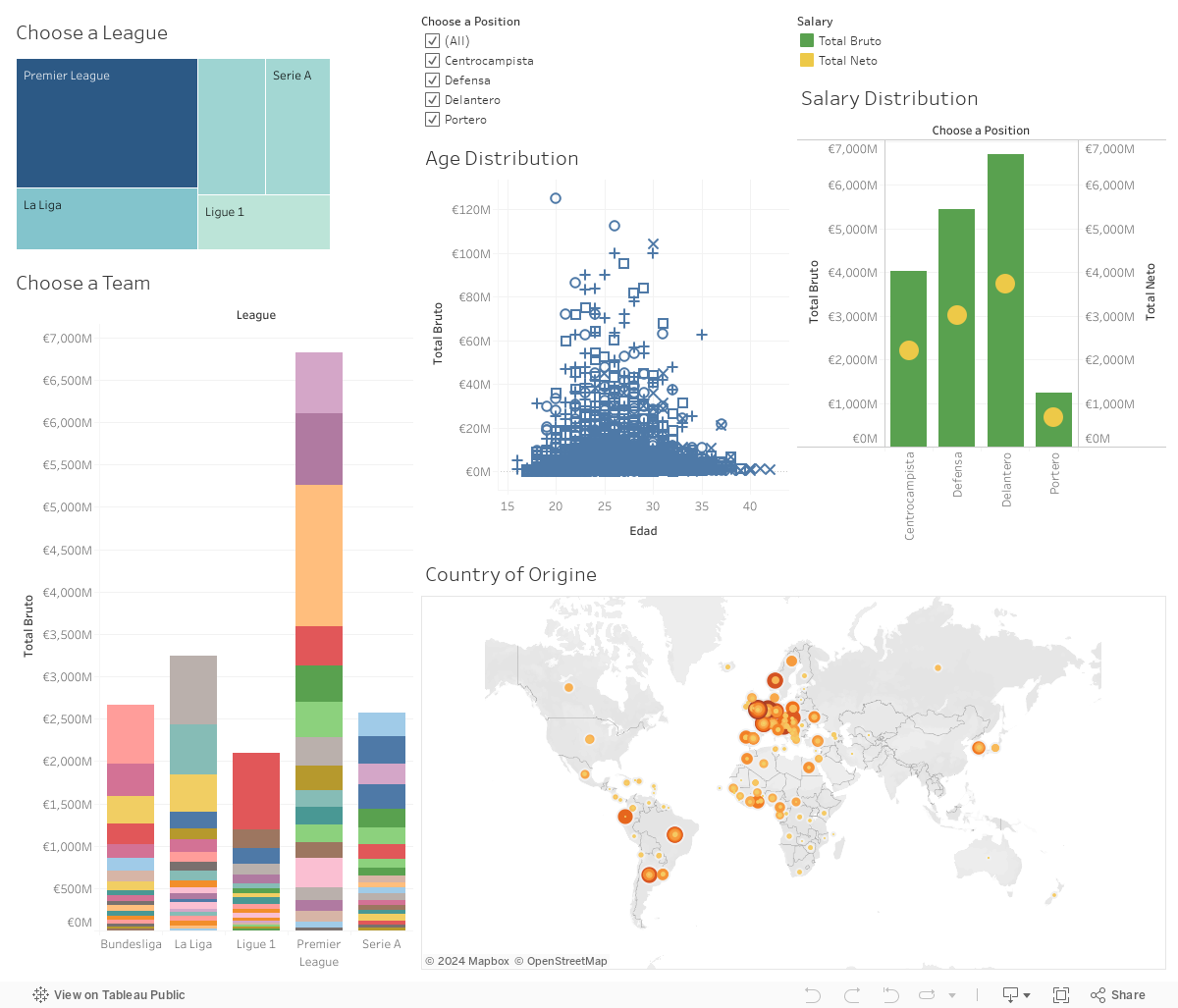
Dashboard created with Tableau
Salary and country of origin of football players in 4 majors leagues in Europe. The data used was scrapped from 3 different websites (the code can be found in my Github page)
Thesis summary
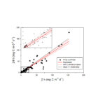
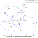
Visualizations for publications
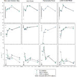
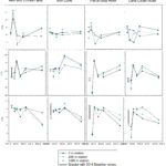
Examples of graphs summarizing environmental data, laboratory experiments and machine learning models.
Application describing the history of La Liga
The application was built with Python language and the streamlit library. The data used is was taken from one website. The code can be found in my Github page.